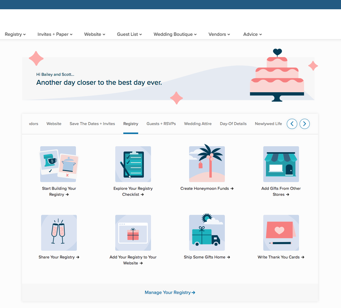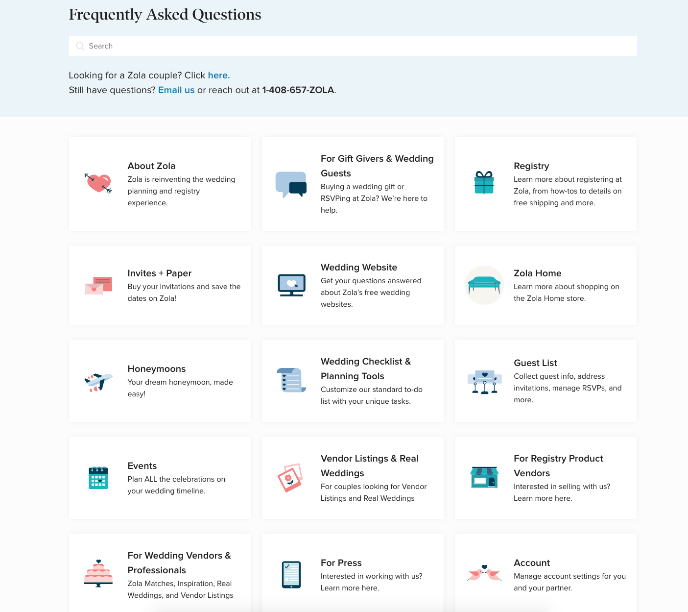


As is the nature with icons, they needed to be legible at a small scale but still a representation of the brand, which has a sort of playful sophistication about it. I used tonal shading and thick chunks of color to give detail without becoming too overwhelming at a small scale. I kept the dark navy throughout to bring contrast to all of the lighter pastel hues. These icons were then used to help inform overall illustration style.
Above is just a small sampling of the library of icons I created.
Art Direction by Alexandra Fortune
Website useage examples pulled from Zola.com
